What a Stream Graph Shows About Overlap That Lines and Stacks Hide
Use a stream graph when several changing categories matter at once and the question is how the flow of attention, volume, or activity shifts across the whole picture, not just one series at a time.
Open Stream Graph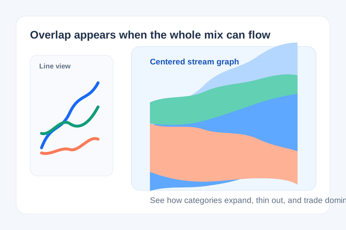
Some datasets are not mainly about ranking, and they are not mainly about one line trend either. They are about how several categories swell, thin out, and trade visual dominance across time. That is the technical niche of a stream graph: it treats the changing mix as one flowing shape so the reader sees overlap and balance shifts together.
The technical principle
A stream graph is closely related to a stacked area chart, but it centers the layers around a flowing baseline instead of pinning everything to one edge. That centered structure reduces the visual weight of the bottom series and makes the movement of the whole composition easier to read as a shared pattern rather than as one privileged baseline plus everyone else stacked on top.
What it reveals better
- Periods where one category expands while another fades, even if the total stays similar.
- Shared seasonality or campaign waves across several channels or topics.
- How attention or volume migrates through a portfolio instead of simply growing in aggregate.
- Whether the whole mix feels stable, lopsided, or constantly trading shape.
Where teams misread it
- They use it when exact point-by-point comparison matters more than overall flow.
- They load too many thin categories into one graph until the layers become decorative noise.
- They expect it to answer the same question as a line chart, then blame the chart for not emphasizing one series enough.
- They forget that labels and time windows still control readability more than color styling does.
Related UtilFlow moves
If your real question is exact trend comparison for one or two series, switch to Line Chart. If you need totals and composition across discrete groups rather than over time, move to Stacked Bar instead of forcing a stream graph into the wrong analytical job.
FAQ
How is a stream graph different from a stacked area chart?
It uses a centered flowing baseline, which makes the composition feel more balanced and emphasizes shifts across the whole mix rather than anchoring everything to the bottom layer.
When is a stream graph a bad choice?
It is a bad choice when the reader needs precise value comparison for individual series or when too many tiny categories make the layers unreadable.
What kind of data suits a stream graph best?
It works best for category volume changing over time when the overall flow and mix shift matter more than exact single-point values.