How to Build a Candlestick Chart From Daily OHLC Data
Turn open, high, low, and close rows into a readable candlestick chart before sharing a market recap or strategy note.
Open Candlestick Chart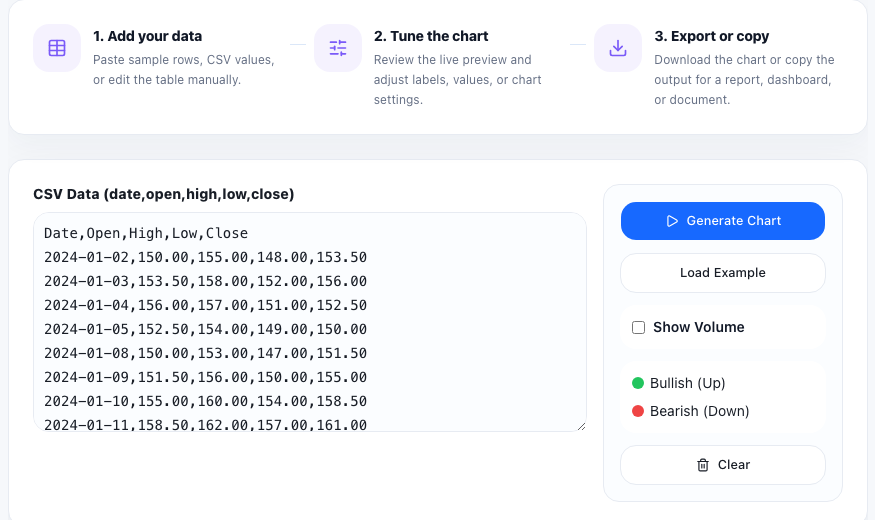
A candlestick chart is often the fastest way to turn a block of market rows into something that another person can actually read. If you already have daily or hourly open, high, low, and close values from a broker export, a spreadsheet, or a backtest note, the job is not to build a full trading terminal. The job is to make the price structure visible enough to discuss.
Start with the four numbers that matter
The clean input pattern is one row per period with open, high, low, and close values. Dates help with labeling, but the core visual logic comes from those four prices. If your source data uses extra columns such as volume, symbol, or comments, separate them first so the chart input stays focused.
A practical tutorial workflow
- Copy a short OHLC sample from your spreadsheet, broker export, or strategy log.
- Check that each row keeps the same column order and that high is never below open, close, or low.
- Paste the rows into the Candlestick Chart tool and preview the first result before loading a larger sample.
- Review whether the candles make the expected swings, gaps, and reversals visible.
- Use the chart as a discussion visual in a report, recap, or trading journal after the structure looks right.
What the chart helps you see quickly
Candles compress several price relationships into one mark. You can spot whether a session closed above or below its open, whether the range widened, and whether rejection happened near the high or low. That makes the chart useful not only for traders, but also for analysts, teachers, and product teams who need a lightweight visual explanation of price movement.
Common input mistakes
Most bad charts come from row-order or column-order problems rather than from the chart itself. Swapped high and low values, mixed separators, partial rows, or copied header text can distort the picture immediately. A short sample check is usually enough to catch the issue before you build the full visual.
When to switch to another chart
Use a candlestick chart when the open-close relationship matters. If you only need a single metric over time, a line chart is simpler. If you want to compare category totals instead of time-based price action, a bar or stacked chart will communicate better.
FAQ
What data do I need for a candlestick chart?
You need one row per period with open, high, low, and close values. A date or label column is helpful, but the chart logic depends on those four prices.
Why does my candlestick chart look wrong?
Check for swapped columns, partial rows, copied headers, or impossible values such as a high that is lower than the open or close.
When is a candlestick chart better than a line chart?
Use candlesticks when you need to show intraperiod range and the open-versus-close relationship, not just the final value at each point.