How to Turn CSV Data Into a Chart Online
Convert a simple CSV table into a clear chart by checking labels, values, chart type, and export settings.
Open CSV Chart Maker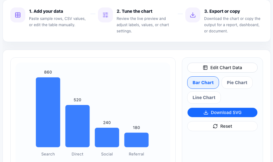
CSV data is easy to move between tools, but raw rows rarely communicate a pattern quickly. Turning CSV into a chart helps you check trends, compare categories, and share a visual result without building a full spreadsheet or dashboard.
Prepare the CSV first
- Use a first column for labels such as month, product, source, or category.
- Use numeric values for the chart series.
- Remove empty rows that do not represent data.
- Keep headers short enough to fit in the visual.
- Check that commas and line breaks are consistent.
Choose a chart type based on the question
Use a bar chart for comparing categories, a line chart for changes over time, and a pie or donut chart only when showing part-to-whole relationships. If the chart feels hard to read, the data may need cleaner labels or a different chart type.
Preview before exporting
After pasting the CSV, inspect the chart before downloading it. Look for missing labels, values that appear as zero, overloaded legends, or a scale that hides important differences.
Where this workflow fits
CSV charting is useful for quick reports, meeting notes, lightweight dashboards, support summaries, marketing snapshots, and any situation where a simple visual is more useful than a pasted table.
FAQ
What CSV format works best for charting?
A simple table with one label column and one or more numeric value columns works best.
Why does my chart show missing or wrong values?
Check for empty cells, non-numeric values, inconsistent delimiters, or headers that were pasted as data.
Can I export the chart after editing the data?
Yes. Preview the chart, adjust the data or settings, then export the final visual when it is clear.