Use a Stacked Bar Chart When Total Growth and Mix Shift Have to Be Read Together
Choose a stacked bar chart when the real problem is reading composition and overall size in the same view without making the audience compare several separate charts.
Open Stacked Bar Chart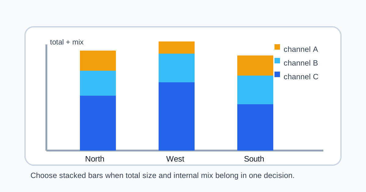
A plain table can tell you the totals. A pie chart can hint at one composition. But when people need to see both the whole size and the inside mix across several groups, the message often falls apart. A stacked bar chart is useful when the problem is not only which total is bigger or which segment is largest but how those two answers change together.
When the reporting problem points to stacked bars
- A sales summary needs to show both total revenue by region and the share from each channel.
- A staffing view needs to compare team size while also showing role mix.
- A budget update needs to show how the total changed and which cost buckets drove the shape of the spend.
- A content or support report needs to compare output volume while keeping the category breakdown visible.
Why separate charts often fail here
If you split the story into one chart for totals and another for composition, the audience has to do the mental merge. That is tolerable for analysts and expensive for everyone else. A stacked bar chart keeps the whole and the parts in one frame, which makes it easier to see that two groups can have similar totals but very different internal makeup.
What a stacked bar chart still does poorly
Only the bottom segment shares a stable baseline across all bars. That means fine comparison between upper segments can become harder as the stack grows. If the real question is precise comparison of each subcategory across groups, a grouped bar or separate small multiples may be clearer.
A better decision test before you build it
- Use stacked bars when both total size and mix belong in the same decision.
- Avoid them when the audience mainly needs exact comparison of every segment across many groups.
- Keep the number of stacked categories manageable so the chart stays readable.
- Label the groups and segment colors clearly enough that the audience does not spend the meeting decoding the legend.
Related UtilFlow moves
If the source starts as a rough CSV export, clean it first with CSV Chart or Table Generator so the grouped values are reliable. If the message is really about one dominant share rather than group-to-group composition, move to Donut Chart or Pie Chart instead of forcing a stacked view onto the wrong question.
FAQ
When is a stacked bar chart better than separate charts?
It is better when the audience needs to understand total size and category composition together in the same comparison.
What is the main weakness of stacked bars?
Upper segments do not share a common baseline, so exact comparison between those segments can become difficult.
How many categories should I stack?
Keep the stack limited to the categories the audience can still read quickly; too many layers usually make the chart harder to use.