Use a Radar Chart When One Average Score Hides Where the Options Actually Differ
Use a radar chart when several options look tied on a simple score but the real decision depends on where each option is strong, weak, or uneven across multiple dimensions.
Open Radar Chart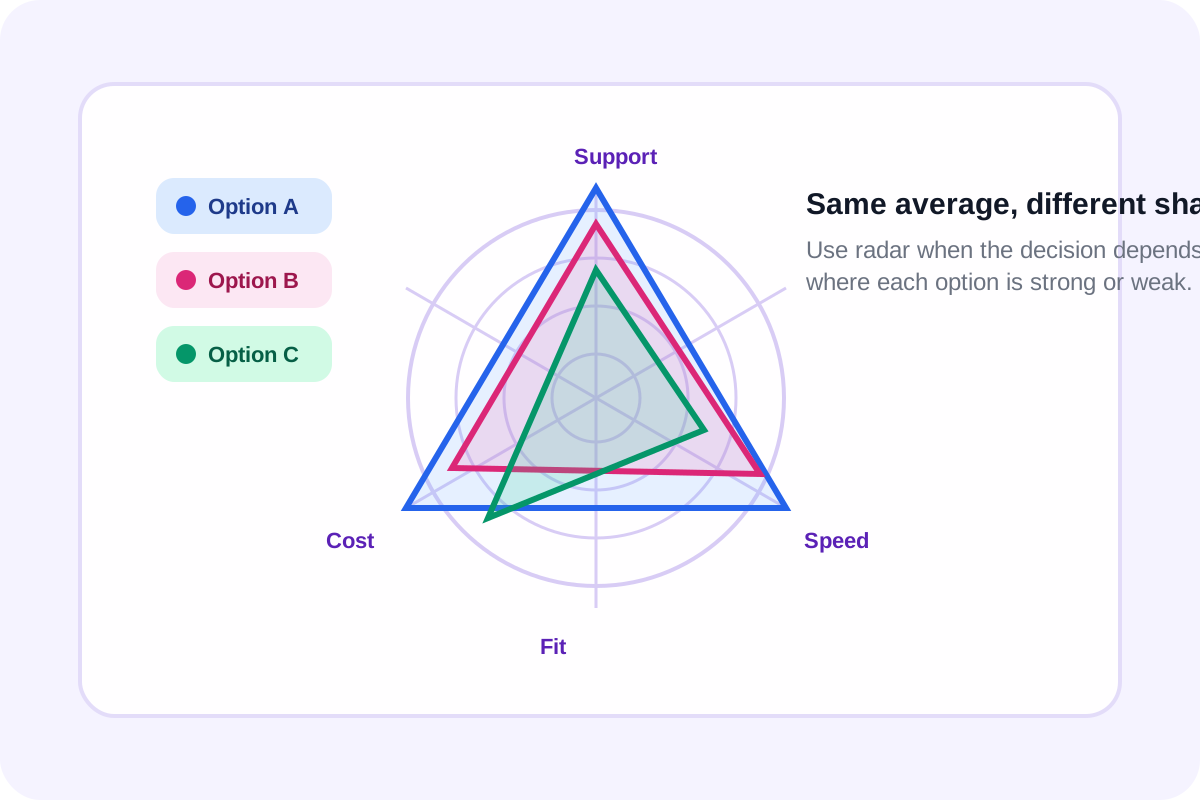
An average score is tidy, but it often hides the actual tradeoff. Two vendors can both score 78 while one is strong on speed and support and the other is strong on cost and integration. A team member can look balanced overall while still having one obvious development gap. A radar chart is useful when the shape of the strengths matters more than one summary number.
Where a radar chart earns its keep
- Comparing candidates across skills where no single metric should dominate the decision.
- Reviewing product options across usability, cost, reliability, support, and implementation effort.
- Showing how a team, region, or business unit differs across the same repeated scorecard dimensions.
- Presenting before-and-after capability profiles where the pattern of change matters as much as the total.
What a radar chart shows better than a table
A table is still better for exact values, but the radar shape answers a different question: where does each option bulge outward or collapse inward? That makes imbalance visible quickly, which is often the real decision input when people are choosing between several imperfect options.
How to keep the chart honest
- Use the same scale on every axis so one dimension is not visually overstated.
- Keep the number of axes modest; if you need fifteen dimensions, a table or bar chart may be clearer.
- Label each axis with a criterion people already understand rather than internal shorthand.
- Do not pretend the chart gives statistical precision. It is for comparison and discussion, not for replacing the raw score table.
Related UtilFlow moves
If the team ends up caring more about one category at a time than about the overall shape, move to Bar Chart next. If the raw scoring still lives in a spreadsheet export, clean it first with CSV Chart Maker before deciding which visual form communicates the comparison best.
FAQ
When is a radar chart better than a bar chart?
It is better when you want to compare the overall profile across several dimensions, not just read one category at a time.
Are radar charts good for exact value reading?
Not especially. Use them for relative shape and balance, then keep the table or score sheet nearby for precise values.
What makes a radar chart hard to read?
Too many axes, inconsistent scales, and too many overlapping series can make the chart harder to trust than a simpler comparison view.