Use a Line Chart When Daily KPI Check-ins Keep Arguing About One Bad Table
Use a problem-first line chart workflow when a daily or weekly KPI table is technically complete but still causing people to argue about isolated numbers instead of the real movement.
Open Line Chart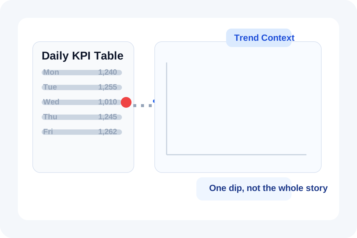
A status meeting can lose twenty minutes because one row in a KPI table looks alarming when it is read by itself. A line chart helps when the disagreement is really about context. Was that dip a one-day anomaly, a normal weekly pattern, or the start of a real decline? The table has the facts, but the shape of the series is what lets the room interpret them correctly.
The reporting problem behind the table
Raw rows invite people to compare whichever number catches their eye first. That is useful for audits and bad for trend discussion. If the actual question is whether the metric is recovering, flattening, or drifting down over several intervals, a line chart solves the framing problem before the conversation turns into selective reading.
Where this happens in real work
- Daily sign-up or traffic reviews where one dip gets over-weighted without the surrounding days.
- Weekly ticket or support volume checks where seasonality matters more than one absolute count.
- Campaign pacing reviews where the team needs to see acceleration or stall, not just totals.
- Operational dashboards where a screenshot of the table travels further than the explanation around it.
A cleaner decision workflow
- Move the ordered dates or intervals into a line chart before the review, not during the argument.
- Limit the chart to the one or two series that actually matter for the decision so the shape stays readable.
- Mark the suspected problem point, then compare it with the previous and following intervals instead of treating it as a standalone event.
- If the line still does not answer the question, change the timeframe or split the metric rather than adding more table columns.
When a line chart still is not enough
If the dispute is about the composition behind the trend rather than the trend itself, move next to a stacked bar, donut, or CSV chart. The line chart helps answer whether something moved. It does not explain every segment inside that move.
Related UtilFlow moves
If the source still lives in a flat export, start with CSV Chart Maker so the data is easier to reshape. If the room later needs exact point comparisons for only one interval, rebuild the relevant slice as a bar chart rather than forcing the line chart to do both jobs.
FAQ
When is a line chart better than a KPI table?
It is better when the decision depends on movement across time or sequence rather than reading one isolated value in a row.
Why do teams argue less after seeing the line chart?
Because the chart shows whether a number is unusual, repeating, recovering, or part of a broader pattern instead of leaving everyone to infer that from raw cells.
What if the trend still feels unclear?
Narrow the timeframe, reduce the number of series, or switch to a chart type that answers the specific follow-up question more directly.