Use a Donut Chart When One KPI Needs Context Without a Full Dashboard
A donut chart works best when one headline number still needs a quick part-to-whole explanation, but the room does not need a whole dashboard or a more precise comparison chart yet.
Open Donut Chart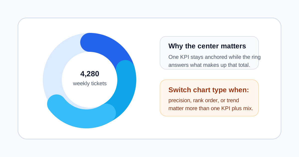
Some reporting moments do not need a full dashboard. They need one number to stay memorable and just enough composition around it to explain what that number contains. That is where a donut chart earns its place. The center can hold the metric people should retain first, while the ring answers the immediate follow-up question: what makes up that total?
Why the donut shape matters technically
The empty center is not decoration. It creates a reserved place for the KPI label, total, or status phrase that would otherwise compete with the legend. That makes the chart better at supporting one headline metric than a pie chart, which can show composition but has no natural place for the total to stay visually anchored.
When the chart type is doing the right job
- A weekly status review needs one top-line volume plus a quick source or category mix.
- A slide should show ticket total, spend total, or survey total without forcing the audience into a full dashboard view.
- A dashboard mockup needs a compact composition card with one center value and a small number of segments.
- A report needs a visual summary where exact rank-order comparison is less important than understanding the whole and the main slices.
When the donut is the wrong choice
If the audience must compare several close values precisely, a bar chart usually wins. If the story is change over time, use a line chart. The donut chart is strongest when the message is one total plus composition context, not measurement precision or trend analysis.
Technical checks before export
- Keep the slice count low enough that the ring still reads quickly.
- Use clear labels and contrast so adjacent slices do not blend into one decorative circle.
- Put the actual remembered metric in the center rather than wasting that space on filler text.
- Preview the chart at the final document or slide size, because donut charts become useless quickly when labels shrink too far.
Related UtilFlow moves
If the data starts as rough rows, clean it in CSV Chart Maker first. If precise comparison suddenly becomes the meeting's real demand, rebuild the same dataset as a bar chart instead of forcing the donut to answer a question it was not designed for.
FAQ
What makes a donut chart different from a pie chart?
The center opening gives you a useful place for the headline KPI or total, which makes the chart better for one-number-plus-context communication.
How many categories should a donut chart usually show?
Usually only a small set. Too many thin slices make the chart decorative rather than informative.
When should I switch away from a donut chart?
Switch when the audience needs precise comparison, ranking, or a time trend rather than a quick part-to-whole explanation.