Turn One Simple Share Table Into a Pie Chart People Can Read in Seconds
Use a pie chart workflow when the question is one share-of-whole story and the room should grasp the split quickly without scanning a full table.
Open Pie Chart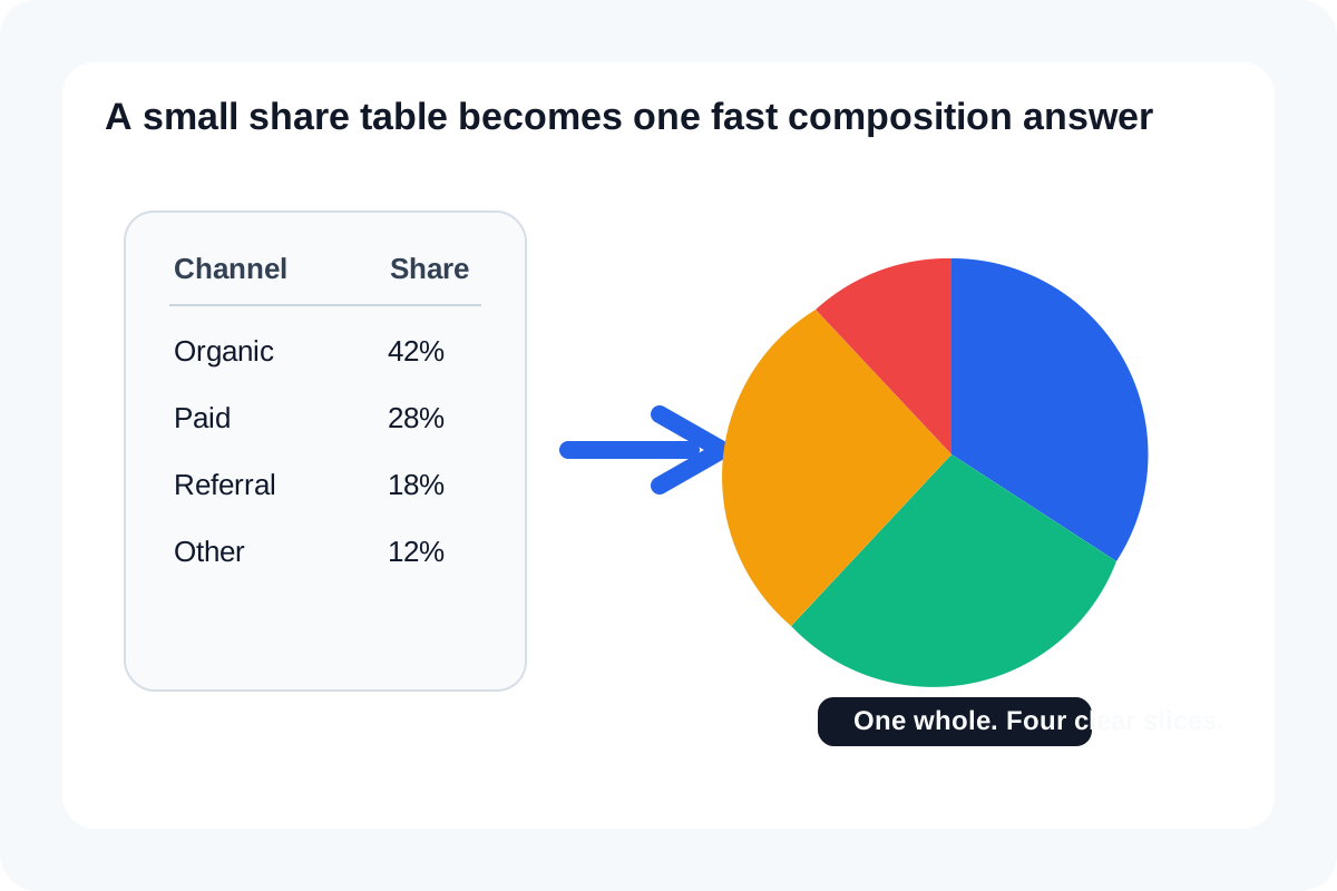
Not every table deserves a chart, and not every chart deserves a dashboard. Sometimes the only question is how one total splits across a few categories: traffic source mix, budget allocation, response types, issue tags, or product share. In that situation, a small pie chart can save time because the room reads the split immediately instead of parsing rows first.
When a pie chart is the right quick answer
- You have one total and a short set of categories that add up cleanly to that total.
- The real question is share, not trend over time or comparison across many groups.
- The number of slices is small enough that labels can stay readable without turning into a legend hunt.
- The chart is supporting a quick decision, slide note, or status update rather than a deep analytical model.
Workflow from small table to readable chart
- Start with a short label-value table and remove categories that do not belong to the same whole.
- Paste the rows into the pie chart tool and confirm the labels are plain enough to read without extra explanation.
- Check that the values really sum to the intended whole and that no slice is duplicated under a slightly different name.
- Preview the chart and look for one clear message: which share is largest, which is smallest, and whether the split is balanced or concentrated.
- Export once the chart can stand beside one sentence without needing the audience to decode the table first.
Checks before you export
- Avoid too many thin slices that make the chart hard to read.
- Use direct category names instead of internal shorthand.
- Make sure the chart still works if someone sees it briefly in a slide deck or meeting note.
- If the audience needs exact comparisons more than composition, switch to a bar chart instead of forcing the pie chart to carry the wrong job.
Related UtilFlow moves
If the data starts as a spreadsheet export, CSV Chart Maker is often the entry point. If one big KPI needs context but the whole does not need a full circle, Donut Chart can be a cleaner presentation. If exact comparisons matter more than share, Bar Chart is usually the better follow-on.
FAQ
When should I use a pie chart instead of a table?
Use it when the main question is one share-of-whole story and the category count is small enough to read quickly.
What makes a pie chart hard to read?
Too many slices, unclear labels, and using a pie chart for comparison tasks that would be clearer in a bar chart.
Should the values add up exactly?
Yes. A pie chart works best when the categories truly belong to one whole and the totals are checked first.