Turn One CSV Export Into a Chart the Room Can Read Before the Meeting Starts
Use a CSV chart workflow when a raw export is technically complete but still too tabular for a room that needs the message quickly.
Open CSV Chart Maker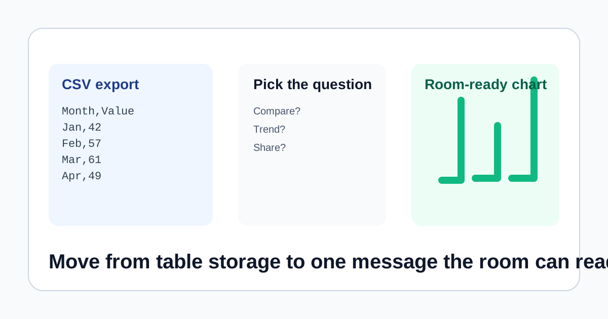
A CSV export often contains the answer and still fails the meeting. The rows are there, the numbers are there, but the audience does not have time to interpret them line by line while a decision is being made. A CSV chart workflow is useful because it shifts the job from storing data to communicating one pattern quickly: ranking, trend, or share.
Start from the question, not from the chart picker
Before choosing a chart type, decide what the room actually needs to see. If the question is which category is highest or lowest, a bar chart is usually the fastest read. If the question is how a number changed over time, move toward a line view. If the question is how one total splits into parts, a pie view may be enough. The CSV file is only the source surface, not the message.
A practical CSV chart workflow
- Paste the smallest clean slice of the export that answers the current question instead of dropping in every available column.
- Check the first column for readable labels and the value column for numbers that still contain no stray notes or formatting artifacts.
- Switch among bar, line, and pie views based on the pattern you want the room to understand, not on which chart looks most decorative.
- Preview the chart once with the actual meeting audience in mind: can someone unfamiliar with the raw export explain the point in a few seconds?
- Download the SVG once the chart communicates one message cleanly, then place it into the slide, note, or report without dragging the whole spreadsheet into the discussion.
What to clean before you chart
- Merged headers or commentary rows that belong in the spreadsheet, not in the chart input.
- Values copied with currency symbols, percent signs, or notes that stop them from behaving as plain numbers.
- Too many categories for the space available, which makes the chart harder to read than the original table.
- Time labels that are inconsistent enough to blur a trend into noise.
Why an SVG export matters here
A fast chart is only useful if it moves cleanly into the next artifact. SVG is lightweight, stays sharp in slides and docs, and gives you a meeting-ready visual without committing to a larger BI workflow for a one-off explanation.
Related UtilFlow moves
If the input still needs reshaping between spreadsheet rows and JSON objects, use CSV JSON Converter first. If you discover that the underlying question is really about a more specific structure, such as funnel stage drop-off or composition across groups, move from CSV Chart Maker into the more specialized chart tool that matches that message.
FAQ
What is the best chart type for a CSV export?
There is no single best type. Use the type that matches the question: bars for comparison, lines for change over time, and pie only for a simple share split.
What should I remove before pasting CSV into a chart tool?
Remove commentary rows, stray formatting, mixed units, and extra columns that do not help the current chart answer one clear question.
Why export the chart as SVG?
Because SVG stays sharp in slides and docs and is easy to reuse when the chart only needs to explain one point quickly.