How to Plot Correlation With a Scatter Plot Before Sharing Results
Turn two-column numeric data into a scatter plot so you can check patterns, outliers, and rough relationships before presenting a claim.
Open Scatter Plot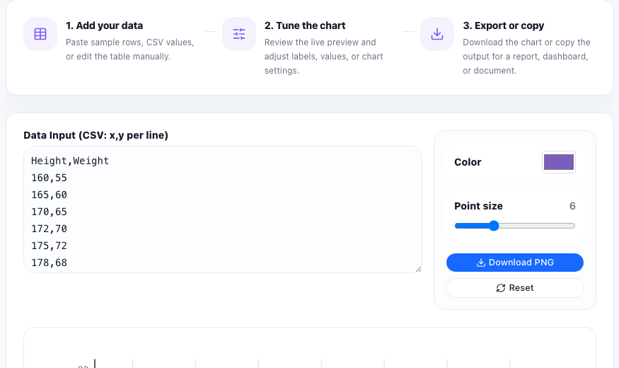
A scatter plot is useful when you have paired values and need to see whether they move together, separate into clusters, or contain suspicious outliers. Common examples include ad spend versus signups, temperature versus energy use, practice time versus score, or price versus conversion rate.
Start with pairs, not summaries
The key input is one row per observation with an x value and a y value. Do not average the rows too early. The whole reason to use a scatter plot is to preserve the variation between observations so the pattern stays visible.
A quick plotting workflow
- Prepare two numeric columns that belong together row by row.
- Paste the values and confirm that each point represents one observation rather than a mixed summary.
- Look for a visible slope, clusters, isolated outliers, or a cloud with no clear direction.
- Check whether a few extreme points are dominating the story before you share the chart.
- Export the visual only after the axes and labels are clear enough that someone else can read the pattern quickly.
What the first preview usually reveals
The first preview often catches practical data problems before any formal analysis starts. You may notice copied rows, zeros that should have been blanks, values on the wrong scale, or groups that should be separated before you compare them. That makes the chart useful as a data-checking step, not only as a presentation step.
When a scatter plot is the wrong chart
Use a scatter plot for paired numbers. If you only need category totals, a bar chart is usually clearer. If you need to show change over time with evenly spaced dates, a line chart usually communicates the sequence better.
FAQ
What data shape does a scatter plot need?
It needs paired numeric values, usually one x value and one y value for each row or observation.
Can a scatter plot prove causation?
No. It can show a visible relationship or lack of one, but it does not prove that one variable caused the other.
Why do outliers matter so much in a scatter plot?
A few extreme points can change the apparent pattern and may indicate data-entry mistakes, unusual cases, or a subgroup that should be analyzed separately.