Turn a Rough Category Count Into a Bar Chart Before the Slide Turns Into a Screenshot
Use a bar chart maker when the room needs to compare categories quickly and the current workflow is still passing around pasted tables or screenshots that hide the point.
Open Bar Chart Maker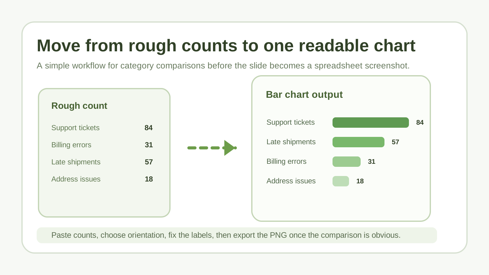
A ranked list is easy to collect and hard to communicate. Someone pastes category counts into a slide, takes a screenshot of a spreadsheet, and then spends the meeting narrating what people should have seen immediately. A practical bar-chart workflow turns that rough count into a visual comparison before the conversation starts.
The simple workflow
- Paste the labels and values from your rough count, CSV export, or manual notes.
- Decide whether vertical or horizontal bars will be easier to read based on label length and the available slide or document space.
- Preview the chart and look for one obvious problem first: truncated labels, wrong sort order, or categories that should be merged.
- Adjust the color and orientation only after the message is already clear.
- Export the PNG when the chart can stand on its own without the original table sitting next to it.
When this is the right chart
- You are comparing discrete categories rather than showing change over time.
- The audience needs to spot the top and bottom items quickly.
- Labels matter and should stay readable instead of rotating into tiny text.
- A lightweight PNG is enough and you do not need a heavier BI workflow for this view.
What to check before export
Make sure the category names are clean, the values use one consistent unit, and the sort order matches the story you want the chart to tell. Most bad charts are not styling failures. They are data-labeling or ordering failures that survived into the visual.
Related UtilFlow moves
If the raw source is still a CSV dump with extra columns, start with CSV Chart or clean it into a smaller table first. If the chart later needs to compare totals and composition together, move to Stacked Bar instead of forcing a simple bar chart to do a different job.
FAQ
When should I use a bar chart instead of a line chart?
Use a bar chart when you are comparing categories or ranked groups rather than showing a continuous trend over time.
Why choose horizontal bars sometimes?
Horizontal bars usually read better when category labels are long or when the chart has to fit neatly into a document or slide column.
What makes a quick bar chart look trustworthy?
Clear labels, consistent units, sensible sorting, and a chart that can be understood without someone having to explain the original spreadsheet first.