Show One KPI With Its Share Breakdown Before the Summary Number Starts Hiding the Mix
Use a donut-chart problem guide when one total is useful, but the real discussion still depends on how that total is divided across sources, segments, or owners.
Open Donut Chart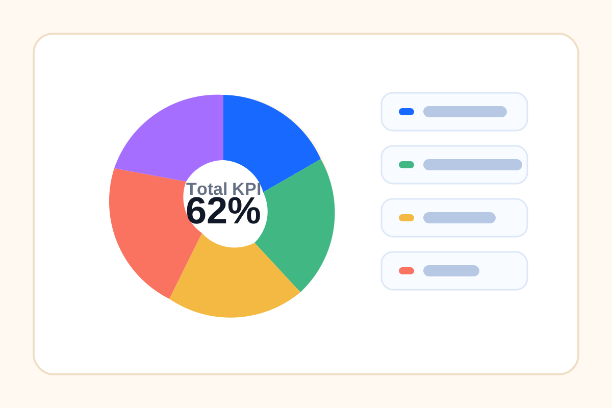
A headline number is great until it hides the thing people actually need to discuss. Revenue hit target, signups increased, tickets dropped, or inventory moved, but the mix under that total may have shifted enough to change the next decision. A donut chart is useful when the audience should see one main total and still understand how the shares inside it are distributed.
The reporting problem this solves
Teams often choose between two bad extremes: a single KPI with no context or a dense table that nobody scans in time. The donut chart sits in the middle. It keeps the total visible while making the category shares readable enough for a fast discussion.
Where this problem shows up
- One monthly KPI needs source breakdown by channel or region.
- A support total looks fine, but the issue-type mix changed materially.
- A launch summary needs to show how one headline result was distributed across offers or audiences.
- A slide needs one focal number without losing the part-to-whole context behind it.
A cleaner decision workflow
- Start with the one total the audience cares about most.
- List the categories that should divide that total, and keep them mutually exclusive.
- Check whether the number of segments is still small enough to read quickly.
- Use the donut chart when the goal is fast mix comprehension rather than precise rank ordering.
- If the category count grows too large, switch to a table or bar chart instead of forcing the donut to carry too much detail.
Why the summary number alone is not enough
Totals are good at ending questions too early. A strong top-line result can hide concentration risk, one failing segment, or a category that suddenly dominates the whole. The donut chart earns its place when the mix changes the meaning of the total.
Related UtilFlow moves
If exact category comparisons matter more than the central total, continue into Bar Chart instead. If the source values still live in a rough sheet or copied rows, clean them in Table Generator or CSV Chart Maker before the chart becomes part of the slide.
FAQ
When is a donut chart better than a single KPI number?
It is better when the audience needs the total and the share breakdown at the same time, not just the top-line result.
What makes a donut chart hard to read?
Too many small segments or categories with unclear labels make the chart slow to scan and weaken the part-to-whole comparison.
When should I switch away from a donut chart?
Switch to a bar chart or table when precise category comparison matters more than showing one central total.