Read Open, High, Low, and Close in One View Before a Price Table Hides the Real Move
Use a candlestick-chart problem guide when a price table has all the numbers but still hides the shape of the session, the direction of pressure, and the range that made the move meaningful.
Open Candlestick Chart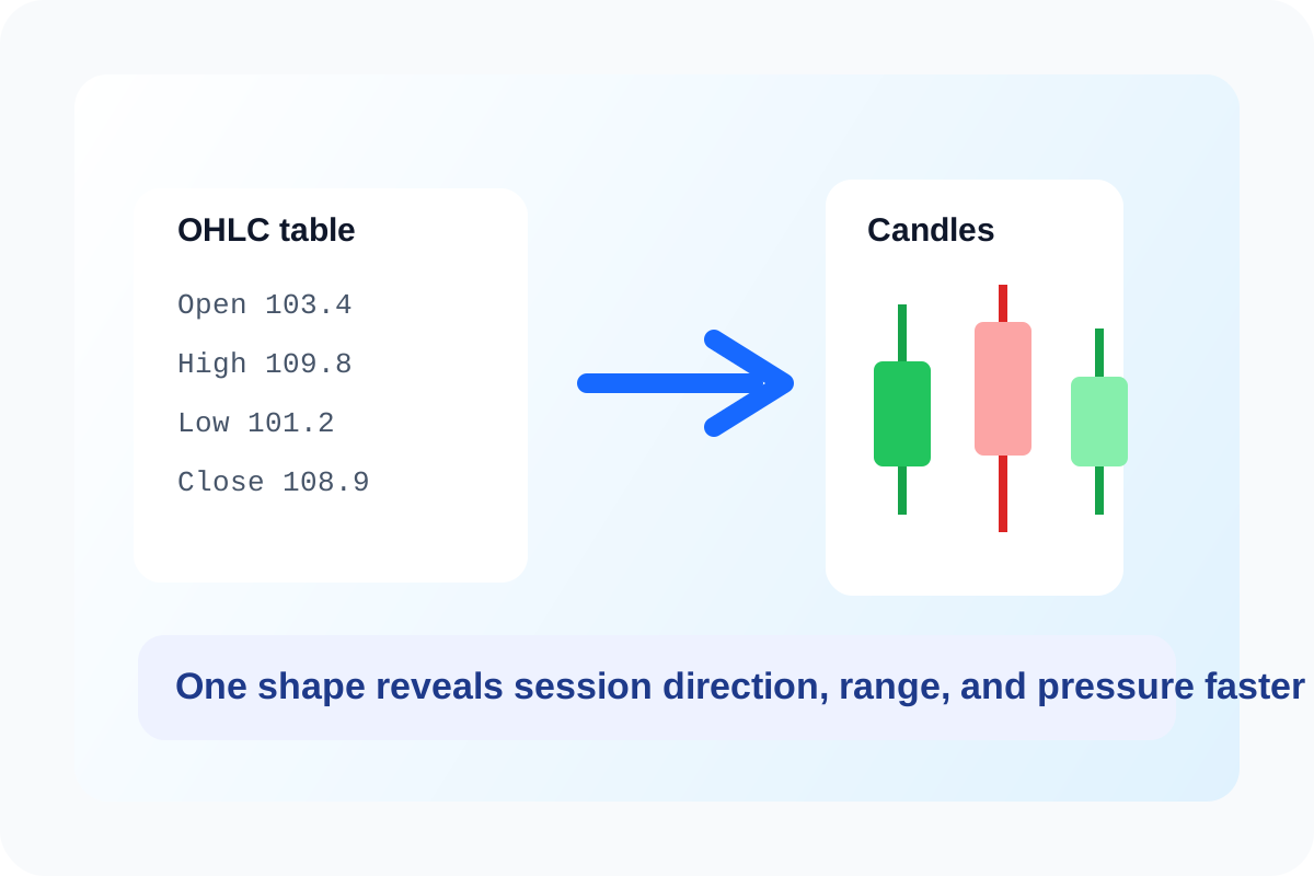
An OHLC table can be accurate and still fail to communicate the day. Open, high, low, and close values tell you what happened, but not how the session felt. Did price push up and fade? Did it drop early and recover? Was the close near the high after a wide range day, or did a narrow indecisive session simply end a little green? A candlestick view turns those four numbers into a shape people can interpret faster.
What the table hides
- The relationship between the open and close is harder to see when the numbers are separated across columns.
- The intraday range does not stand out visually even when it was the most important part of the move.
- A sequence of sessions is difficult to scan for momentum or hesitation when every row looks equally flat.
- Readers who are not market specialists often miss the story because the data remains in numeric form only.
Why a candlestick chart solves a communication problem
A candlestick compresses four values into one readable mark. The body shows where the session opened and closed. The wicks show how far price pushed beyond that body. Once several candles sit together, continuation, reversal, long-range volatility, and quiet indecision become easier to discuss than they are in a plain table.
A cleaner charting workflow
- Start with one short sequence of clean OHLC rows rather than a noisy export full of columns the chart does not need.
- Plot the candles and inspect whether the body and wick shapes match the story you expected from the raw numbers.
- Check for one or two sessions where the close location matters, such as a day that finished near the high or low after a wide range.
- Use the chart when the audience needs to read the move itself, not merely verify that four values were captured.
- Download the final SVG or PNG once the sequence communicates the pattern you actually want the room to notice.
When not to use this chart
Do not force a candlestick chart when the audience only needs a single closing-price trend or when the data does not truly contain open, high, low, and close values. In those cases a line chart or another simpler view communicates more honestly.
Related UtilFlow moves
Use Line Chart when the close-to-close trend is the only story that matters. If the dataset begins in CSV form with extra columns, clean the relevant OHLC rows first so the chart is not carrying avoidable noise.
FAQ
Why not just share the OHLC table?
Because the table keeps the values accurate but makes the session shape much harder to see at a glance.
What does the candlestick body tell me first?
It tells you the relationship between the open and close, which is often the quickest read on session direction.
When is a candlestick chart the wrong choice?
It is the wrong choice when you do not have true OHLC data or when the audience only needs a simpler closing-price trend.