Plot Two Columns First So One Outlier or Flat Cluster Does Not Hijack the Decision
Use a scatter plot workflow when two-column data is about to become a claim about correlation, efficiency, or quality and you need to see the actual shape before a meeting locks onto the wrong story.
Open Scatter Plot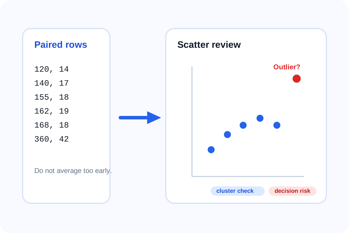
Two-column data tempts people into fast narratives. Spend versus leads, practice hours versus score, response time versus satisfaction, price versus conversion. The trouble is that the relationship may be flat, split into two clusters, or distorted by one exceptional point. A scatter plot workflow puts the shape on screen before someone turns a rough pattern into a confident recommendation.
Start with the raw paired rows
Do not average the rows away too early. The whole reason to use a scatter plot is to preserve observation-level variation. Once the variation is hidden inside grouped totals, the evidence for clusters, gaps, and suspicious outliers often disappears with it.
A decision-oriented scatter plot workflow
- Paste one row per observation with one x value and one y value.
- Render the scatter plot before adding commentary so the point cloud can speak first.
- Check whether the points form a slope, a flat cloud, several groups, or one dramatic outlier.
- Ask whether any single point is a data-entry issue, a special case, or a signal that the dataset should be split.
- Only after that should you decide whether the relationship is strong enough to mention, weak enough to downplay, or mixed enough to annotate carefully.
What to look for in one minute
- A flat cloud that does not support a strong correlation story.
- Two or more clusters that may represent different populations or operating modes.
- One distant point that changes the visual impression of the whole set.
- A narrow band that suggests the relationship is real enough to explore further.
When to stop and switch charts
If your data is really category totals, not paired observations, switch to a bar chart. If the primary message is change over ordered time, a line chart will usually carry it better. The scatter plot earns its keep when the question is about paired-number behavior rather than sequence or totals.
Related UtilFlow moves
If the data still lives in a CSV export, move through CSV Chart Maker first for a broader chart preview pass. If the final story is simpler than the raw paired data, a line or bar chart may be the clearer next artifact after the scatter review.
FAQ
Why use a scatter plot before talking about correlation?
Because it lets you inspect the actual point pattern before a summary claim hides outliers, clusters, or a flat relationship.
Can one outlier really change the takeaway?
Yes. A single distant point can make the overall relationship look cleaner or stronger than the main data cloud supports.
What should I do if the points split into clear groups?
Treat that as a sign to annotate or separate the groups rather than pretending one simple relationship covers all observations.