Find the Real Drop-Off Before Every Team Blames a Different Stage
Use a funnel chart when the real problem is not building a prettier conversion visual but settling which stage actually loses people, deals, or applications.
Open Funnel Chart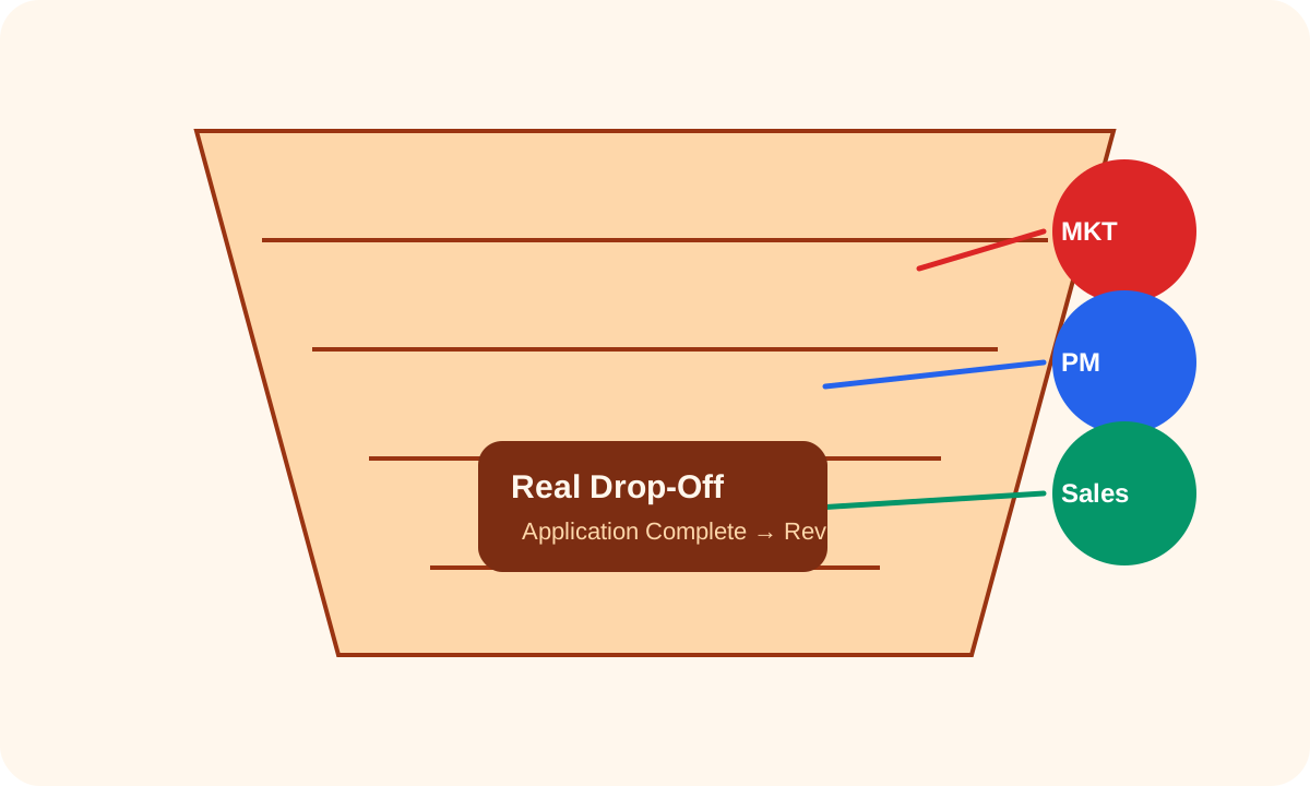
Conversion arguments often happen because each team is staring at a different slice of the journey. Marketing thinks the top of funnel is weak, product thinks activation is the leak, and sales thinks qualification is the real choke point. A funnel chart helps when the problem is not lack of opinion. The problem is that nobody is looking at one ordered picture of the same flow.
What the problem usually looks like
- Traffic is up, but no one agrees where the pipeline actually narrows.
- Application volume looks healthy at the first step, but later reviewers feel the flow is 'mysteriously thin.'
- A stage owner says their conversion is fine while the next team says inputs arrive unusable or incomplete.
- Weekly dashboards compare percentages but never show the actual ordered counts that explain them.
Why a funnel chart helps here
A funnel chart forces one sequence and one count per stage. That is useful because it removes the escape hatch of discussing unrelated ratios, screenshots, or anecdotes. Once the stages are visible together, the team can stop debating where the leak feels largest and start checking where the count actually drops.
Where teams still get fooled
The visual is only honest if the stages belong to one process and one time window. If signup counts come from this week, qualification counts come from last month, and closed counts include recycled deals, the chart will still look clean while telling the wrong story. The problem is not the chart shape. It is the stage discipline behind it.
A cleaner problem-solving pass
- List the actual stage sequence in the order people move through it.
- Use raw counts from the same reporting window before turning them into percentages.
- Plot the funnel and identify the first stage where the drop materially changes the story.
- Ask whether that drop reflects acquisition quality, process friction, qualification rules, or measurement mismatch.
- Only after the stage loss is visible should you assign ownership or propose fixes.
Related UtilFlow moves
If the real need is comparing unrelated categories rather than a narrowing sequence, switch to Bar Chart or Stacked Bar. If the question is whether two variables move together, Scatter Plot is a more honest next tool than forcing the dataset into a funnel.
FAQ
When is a funnel chart the right problem-solving view?
Use it when the categories are sequential stages in one narrowing flow and the team needs to see where the count truly drops.
Why do teams argue even when they already have conversion percentages?
Because percentages often hide the ordered counts and stage definitions that show where the real leak begins.
What should I verify before blaming one stage owner?
Verify that every stage uses the same entity, the same reporting window, and one consistent process definition before you assign ownership.