Compare Options on a Radar Chart Before One Average Score Hides the Tradeoff
Use a radar chart tutorial when several choices look close on one summary score but the real decision depends on which option is uneven, balanced, or clearly stronger on specific criteria.
Open Radar Chart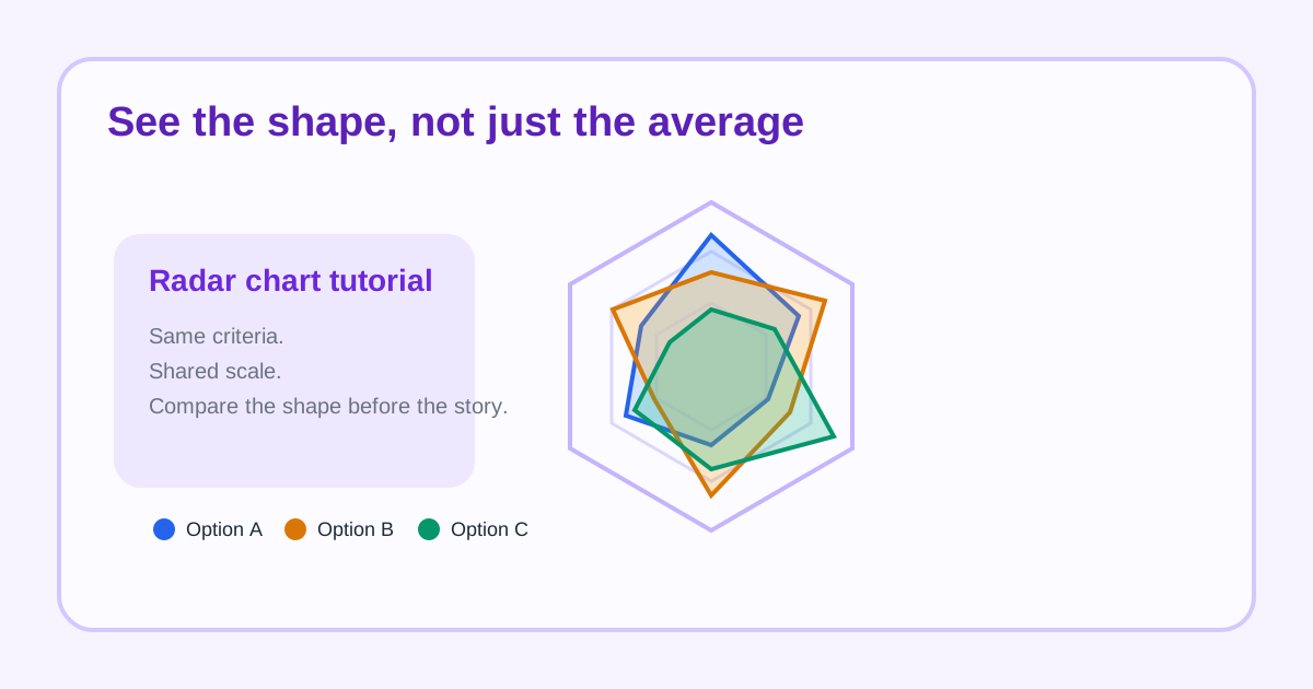
A radar chart is useful when the decision depends on the pattern, not only the total. Three options may all score in roughly the same band overall, yet one has weak support, another has stronger cost control, and a third is balanced but less impressive anywhere. The radar view makes that shape visible before an average score flattens the story.
A simple radar-chart tutorial
- List the repeated criteria first so every option will be measured on the same axes.
- Enter one row per option with one score per criterion.
- Render the chart before editing the story around it; the shape often exposes the real tradeoff immediately.
- Check where each option pushes outward or collapses inward rather than reading only the total impression.
- Use the chart as a comparison aid, then keep the raw table nearby for exact values and final weighting.
Where this works well
- Vendor selection across cost, reliability, implementation effort, and support.
- Role or candidate comparisons across several skills.
- Product or feature evaluation where balance matters more than one peak score.
- Before-and-after scorecards where the change pattern matters as much as the total change.
How to keep the chart readable
Use a shared scale on every axis and keep the dimension count modest. Once the chart carries too many axes or too many overlapping series, the shape stops clarifying the decision and starts hiding it again.
What the chart cannot decide for you
A radar chart does not decide weighting, business priority, or risk appetite. It simply exposes whether the options differ in shape. That still matters, because teams often think they disagree on a final score when they actually disagree on which weakness they can tolerate.
Related UtilFlow moves
If the group cares more about one category at a time than the overall shape, switch to Bar Chart next. If the scores start as a CSV export, route them through CSV Chart Maker first and then decide whether the radar view is the clearest final presentation.
FAQ
When is a radar chart better than one average score?
It is better when the distribution of strengths and weaknesses matters more than a single rolled-up number.
Should I use a radar chart for exact value reading?
Not by itself. Use it for shape and comparison, then keep the source table nearby for precise values.
What makes radar charts hard to trust?
Too many axes, inconsistent scales, and too many overlapping options can make the visual impression less reliable than a simpler chart.