How to Build a Stream Graph From Overlapping Channel Volume
Turn time-based category totals into a stream graph so you can compare changing volume across channels without flattening everything into one line.
Open Stream Graph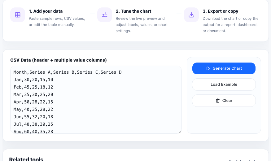
A stream graph helps when one total is made of several categories that rise and fall over time. Think support tickets by queue, traffic by acquisition channel, listens by playlist type, or budget share by program. Instead of collapsing everything into one total line, the chart keeps each layer visible so the volume shifts are easier to compare.
Prepare the dataset for layering
- Use one time period per row or column, depending on the tool input shape.
- Keep each category as its own numeric series so the stacked layers can be separated clearly.
- Use consistent period labels such as weeks or months instead of mixing date formats.
- Remove categories that are mostly empty if they make the chart harder to read than the story requires.
A simple stream-graph workflow
- Paste the time labels and category values into the chart input area.
- Preview whether the category names and time periods are readable before worrying about color tweaks.
- Look for where one layer swells, shrinks, or disappears because that usually marks the real change in the story.
- Check whether the overall total moved because the whole system changed or because one category replaced another.
- Export the graphic only after the legend and labels are clear enough for someone else to follow the layers.
When a stream graph works better than a line chart
A line chart is often clearer for one or two series. A stream graph becomes useful when the story depends on composition as well as total volume. It shows not only whether the total grew, but which categories expanded or contracted inside that total.
What to check before you share it
If the chart feels noisy, reduce the number of categories or shorten the time range. Stream graphs are strongest when the audience can track the major layers quickly instead of decoding a wall of small bands.
FAQ
What data shape does a stream graph need?
It needs time-based labels plus multiple numeric category series that can be layered across those time periods.
When is a stream graph better than a stacked bar chart?
Use a stream graph when the main comparison is how category volume changes across many time periods rather than across just a few discrete groups.
Why can a stream graph become hard to read?
Too many small categories, inconsistent labels, or a long crowded timeline can make the layers difficult to follow.