How to Build a Stacked Bar Chart to Compare Composition Across Groups
Use a stacked bar chart when each total needs to stay visible while the mix inside each category still matters.
Open Stacked Bar Chart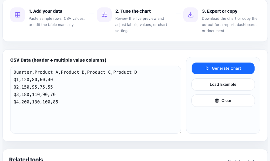
A stacked bar chart is useful when one number alone is too shallow. You may want to show total support tickets by month, but also split that total into billing, onboarding, bugs, and account changes. You may want to compare pipeline volume by region, but still show how much came from outbound, referrals, paid campaigns, and partners. The point is to keep the total visible while preserving the mix.
When stacked bars communicate better than simple bars
A normal bar chart is stronger when each group has only one measure that matters. A stacked bar chart becomes better when composition matters just as much as size. It lets a reader compare both the height of the whole bar and the internal distribution inside it.
A practical setup tutorial
- Start with one group label per row, such as month, team, product line, or market.
- Add one numeric column for each segment that will stack inside the bar.
- Keep segment names consistent across every row so the same color always means the same thing.
- Preview the chart and check whether the legend, labels, and relative segment sizes remain readable.
- Export the chart only after the grouping order supports the story you want to tell, such as chronological order or largest total first.
What to avoid in the data table
Stacked bars get hard to read when there are too many tiny segments or when the categories are not parallel. If one row splits by source and another row splits by product type, the visual stops being a real comparison. Keep the same segment logic across the full table.
Where this chart is especially useful
This chart works well for budget mix, channel mix, staffing allocation, feature-usage split, response volume by type, or any report where the audience needs to see both how big each group is and what makes it up.
FAQ
When should I use a stacked bar chart instead of a grouped bar chart?
Use a stacked bar chart when the total per group matters and the audience also needs to see the composition inside that total.
Why are some segment comparisons hard to read in stacked bars?
Only the first segment in each bar shares a clean baseline. Small middle segments can be harder to compare precisely across groups.
What data structure works best for a stacked bar chart?
Use one label column for the groups and several numeric columns for the segments that should stack in a consistent order.