How to Build a Radar Chart to Compare Options Across Criteria
Use a radar chart when several options need to be compared across the same scorecard without flattening the tradeoffs into one average.
Open Radar Chart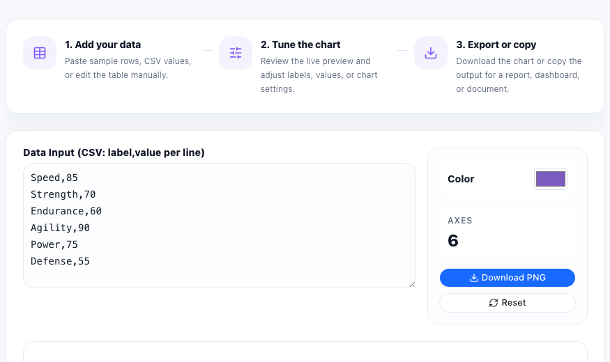
A radar chart helps when one decision depends on several criteria at the same time. You might be comparing software vendors across onboarding, reporting, automation, and cost control. You might be comparing campaign ideas across reach, effort, and expected conversion. The point is not to create one average score too early. The point is to see each option's shape across the same axes.
Start with one shared score scale
Before you paste any values, decide on a consistent scoring method such as 1 to 5, 1 to 10, or percentage points. A radar chart only works if every axis means the same kind of magnitude. Mixing raw counts, percentages, and subjective ratings in one shape makes the chart look precise while hiding inconsistent measurement.
A practical radar-chart workflow
- List the comparison criteria you will score on each axis, such as speed, accuracy, support, or cost.
- Assign one score per criterion for each option using the same scale across the full chart.
- Paste the values and preview whether the labels are still readable when arranged around the circle.
- Look for where one option expands clearly beyond another instead of focusing only on the total filled area.
- Export the chart only after the axes are clear enough that a reader can understand the tradeoffs without your narration.
What the radar shape helps reveal
A radar chart makes unevenness visible fast. One option may look balanced but unexceptional. Another may dominate on automation and customization while dropping badly on support or setup effort. That shape is often more useful for an early decision discussion than a single weighted average because it preserves where the tradeoff actually lives.
When to switch to another chart
If the audience needs exact score comparison, a bar chart or table may be clearer. Radar charts are strongest when you need a quick visual profile of strengths and weaknesses across repeated criteria, not when each number has to be read precisely.
FAQ
What kind of data works best in a radar chart?
Use repeated criteria with comparable numeric scores, such as capability ratings, evaluation scores, or attribute comparisons on a shared scale.
Why should every axis use the same scale?
If the scales differ, the shape becomes misleading because some axes visually dominate for measurement reasons instead of real performance differences.
When is a radar chart better than a table?
It is better when you want a fast visual profile of relative strengths and gaps across several criteria before diving into exact numbers.