Build a Quick Bar Chart From Ranked or Counted Data
Turn simple category counts or ranked values into a readable bar chart before a report, meeting, or slide deck needs a visual.
Open Bar Chart Maker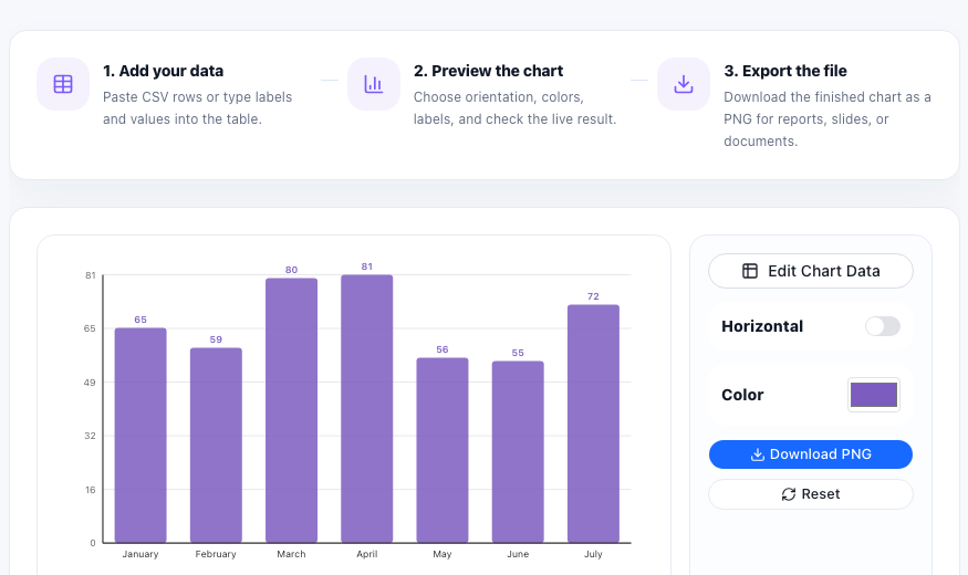
Bar charts work best when the question is simple: which category is larger, smaller, or highest ranked? That makes them useful for survey counts, traffic sources, issue volume, product comparisons, budget lines, and any table where the audience should compare discrete groups quickly.
Start with one label column and one value column
A quick bar chart does not need a complicated dataset. In most cases, one label column and one numeric value column are enough. Short labels help, because the cleaner the axis is, the faster the chart becomes readable in a meeting or slide.
A lightweight bar-chart workflow
- List the categories in the order you want people to compare them.
- Enter the numeric values and check that every value is really numeric, not copied as text.
- Preview the chart and look for labels that wrap awkwardly or values that create accidental clutter.
- Export the chart once the comparison reads clearly at a glance.
When a bar chart is better than a pie chart
Use a bar chart when precise comparison matters. Bars share a common baseline, so readers can compare differences more reliably than they can with slices. If the goal is ranking or side-by-side comparison, bars usually do the job faster.
What makes the final chart easier to trust
Keep labels honest, keep categories consistent, and avoid adding more series than the chart needs. A simple bar chart is valuable because it reduces cognitive load, not because it looks complex.
FAQ
What data shape works best for a quick bar chart?
One label column and one numeric value column work best for a simple comparison chart.
When should I sort the bars?
Sort them when ranking matters more than the original input order, such as highest to lowest counts or scores.
Why choose a bar chart over a pie chart?
Bars share a common baseline, which usually makes comparisons faster and more accurate.