Build a Candlestick Chart from One OHLC Export Before the Price Story Flattens Into Averages
Use a practical candlestick chart tutorial when a price table already has open, high, low, and close data, but the next conversation still keeps collapsing the session into one misleading average.
Open Candlestick Chart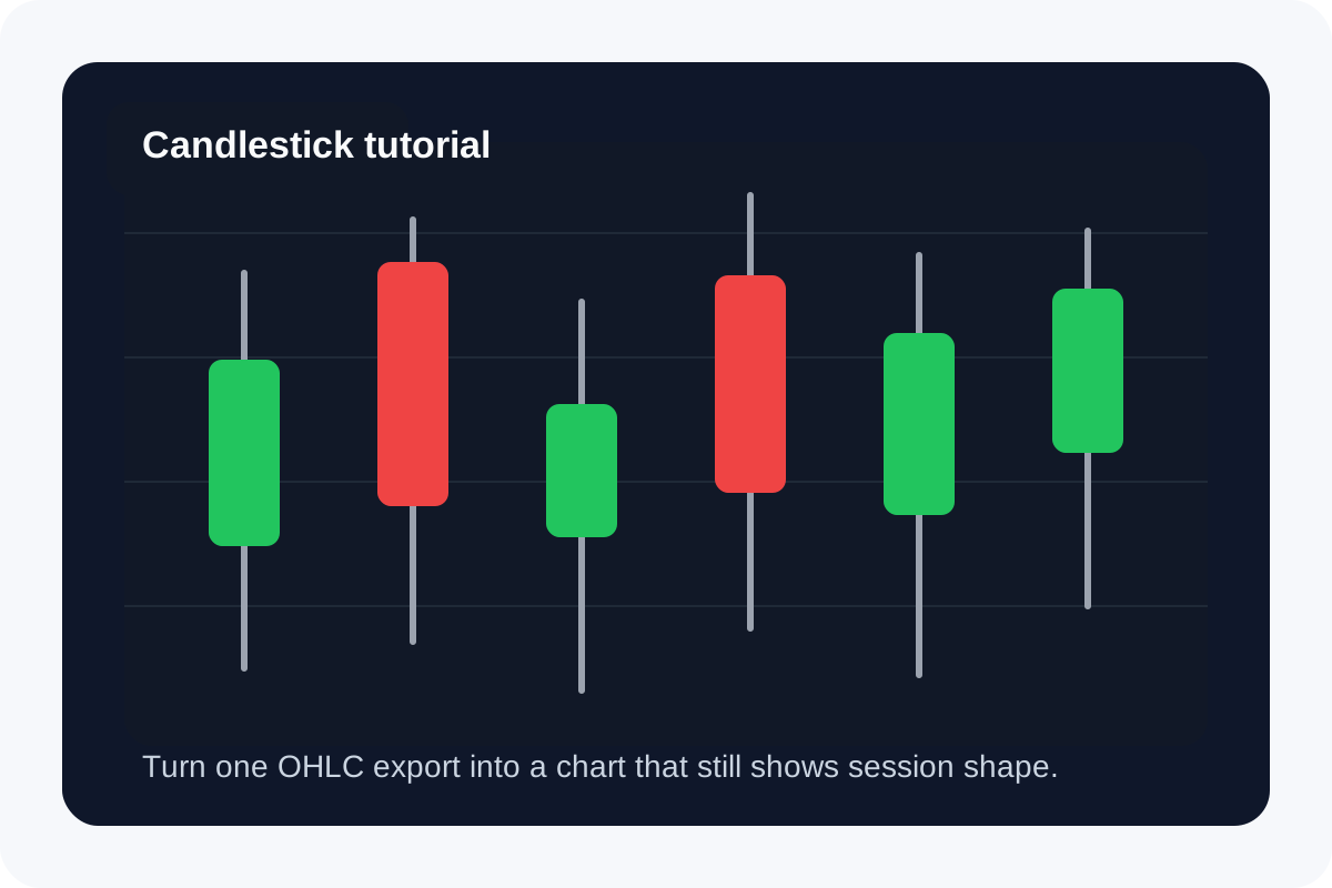
A candlestick chart becomes useful the moment a simple line or average starts hiding what happened inside the session. If your export already contains open, high, low, and close values, the tutorial job is not complicated finance theory. It is turning one clean OHLC table into a visual that still shows range, direction, and the shape of the move.
A practical tutorial flow
- Start with one short OHLC sample instead of a huge export so you can confirm the column order first.
- Make sure each row represents one consistent period such as a day, hour, or week before you judge the pattern.
- Paste the labels together with open, high, low, and close values into Candlestick Chart and preview the first render.
- Check whether the candle bodies and wicks match what the source table says happened in that period.
- Only after the first sample looks right should you expand the dataset or export the chart for the note, slide, or review thread.
Where the tutorial usually saves time
- A raw table can tell you the final close but still hide whether the session sold off, recovered, or stayed volatile all day.
- A line chart can flatten intraperiod range into one point per row, which is too little context when the spread matters.
- Users often paste columns in the wrong order once and then mistrust the whole chart, so the first small sample is worth the minute it takes.
What to inspect before you trust the visual
Pick one row from the source and verify it by hand. The wick should cover the high-to-low range, and the body should span the open and close. If that one row does not match, the issue is usually column mapping or period labeling rather than the chart itself.
Why a candlestick chart beats the average here
This tutorial matters because price stories often break when the only visible number is a close or average. A candlestick chart preserves session structure. You can see whether the move was one clean trend, a reversal, or a noisy range that happened to finish near where it started.
Related UtilFlow moves
If the source starts as a spreadsheet export with extra columns, use CSV Chart first to isolate only the rows and fields you want to visualize. If the next question is not price-action shape but contribution to a total, switch to Waterfall Chart instead of forcing the wrong chart type.
FAQ
What columns do I need for a candlestick chart tutorial?
You need a label for each period plus open, high, low, and close values in a consistent order.
Why not use a line chart for the same data?
A line chart usually emphasizes one value per period, while a candlestick chart preserves both the direction and the full price range inside that period.
What is the fastest way to verify the chart is mapped correctly?
Check one known row manually and confirm that the wick covers the high and low while the candle body reflects the open and close.