Use a FIFA 2026 Stats Chart When the Scoreline Hides How the Match Was Actually Played
Use a match-stats problem workflow when one final score is too thin to explain possession, shot volume, pressure, or control in a FIFA 2026 discussion.
Open FIFA 2026 Stats Chart Maker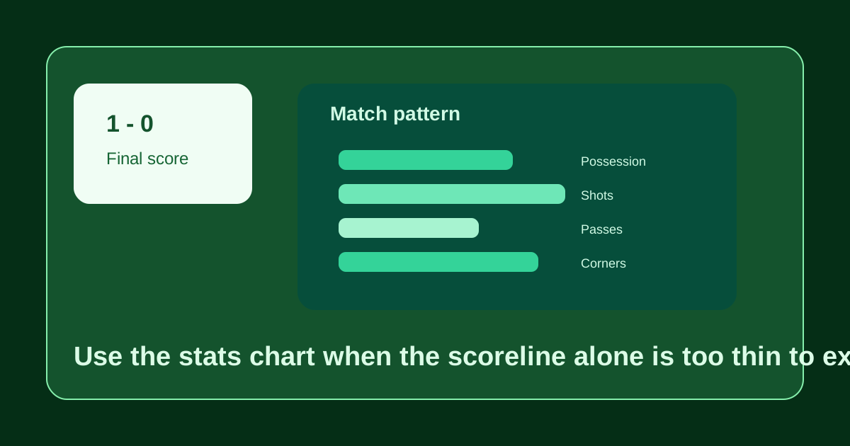
A final score is great for remembering who advanced and poor for explaining how the match actually behaved. One team may have had more possession, more shots, more corners, and still lost to a single transition moment or penalty. When that gap matters, a stats chart is the cleaner artifact. It turns scattered numbers into one visual comparison that makes the match story easier to discuss without pretending the scoreline tells everything.
What problem this solves after the match
Post-match discussion often gets stuck between two weak options: one isolated scoreline or one dense stat table. The scoreline is too thin. The table is too slow. A side-by-side stats chart helps when the audience needs the balance of play in a form that can survive chat, a newsletter, a social recap, or an internal analysis note.
Where this helps most
- Match recaps where the result and the performance pattern seem to disagree.
- Team discussions about whether territory, shot quality, or discipline changed the game.
- Preview or recap notes that need one reusable visual instead of a paragraph of raw numbers.
- Content workflows where a lightweight SVG chart is easier to share than a full spreadsheet or dashboard export.
A clearer comparison workflow
- Enter the same stat categories for both teams so the comparison stays structurally fair.
- Keep only the metrics that help explain the match story instead of loading every available number.
- Preview the chart and ask whether a neutral viewer could tell the broad pattern of control or pressure quickly.
- Export the SVG once the chart highlights the useful tension between the scoreline and the underlying stats.
- Pair the chart with one sentence of interpretation so the visual supports the story instead of forcing viewers to guess the takeaway.
What to leave out
Do not overload the chart with every metric the broadcast feed exposed. If the purpose is showing why the match felt different from the score, pick the categories that actually explain that gap, such as possession, shots, big chances, passes, corners, or fouls.
Related UtilFlow moves
If the next asset should look more like a branded share card, continue into Scoreboard Image Maker or Match Poster Maker after the chart. If the question is standings rather than one match pattern, switch to Group Table Maker instead of stretching the stats chart into a job it was not meant to do.
FAQ
Why use a stats chart instead of only the final score?
Because the score alone often hides possession, shot volume, discipline, and territory patterns that explain how the match unfolded.
Which stats belong in a football comparison chart?
Use the metrics that explain the story you need to tell, such as possession, shots, passes, corners, fouls, or chances, and leave out the noise.
When should I export the match stats chart?
Export it once the chosen metrics reveal the pattern clearly enough that a viewer can understand the match context in a few seconds.