Build a Working Color Palette Before Every Slide or Card Gets a Different Blue
Use a workflow-first color palette guide when one brand color keeps multiplying into inconsistent cards, slides, charts, and quick mockups.
Open Color Palette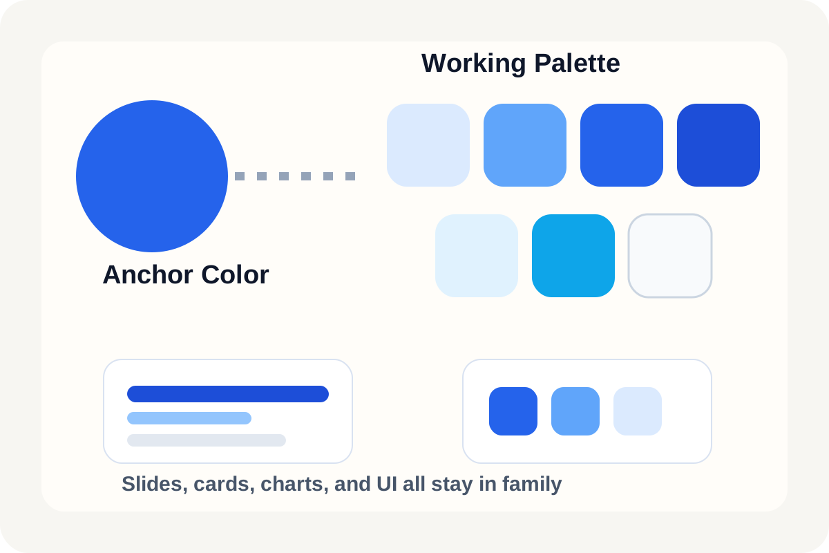
Visual inconsistency often starts with good intentions. One teammate lightens the brand blue for a card, another chooses a darker version for headings, and someone else grabs a different accent for a chart legend. A palette generator is useful because it turns one trusted starting color into a small working system before those local decisions drift apart.
A practical palette workflow
- Start from the one color that already has approval, not from a fresh guess inside the slide or editor.
- Generate a range of lighter, darker, and supporting options so backgrounds, headings, accents, and subtle dividers can all come from the same family.
- Choose only the colors needed for the current job, usually one primary, one accent, and two or three support values.
- Preview the palette against the real asset type, such as a slide card, dashboard tile, or chart legend, before it spreads into more files.
- Copy the final values into the next tool so the palette becomes reusable instead of being rediscovered by eye.
What to check before the palette leaves the page
- Can headings, surfaces, and emphasis all be distinguished without using the same saturated color everywhere?
- Do the lighter tones still look intentional rather than washed out?
- Does the accent clash with chart colors, badges, or callout backgrounds?
- Will the palette still make sense when someone else copies the values into CSS, slides, or image tools?
Why this saves time later
A tiny palette decision early in the workflow prevents repeated micro-decisions later. Once the working set exists, people stop re-solving the same color problem in every slide, screenshot annotation, or quick UI mockup.
A good stop point
Stop when you have enough range to express hierarchy clearly. More colors rarely help. The working set should make the next artifact easier to build, not introduce a new design system to maintain.
Related UtilFlow moves
If the anchor color comes from a screenshot or product photo, sample it first with Image Color Picker. If the receiving tool needs exact HEX, RGB, or HSL output, continue into HEX RGB HSL Converter after the palette is chosen.
FAQ
When should I generate a palette instead of choosing colors manually?
Generate one when a known brand or product color already exists and the real task is building consistent support colors around it.
How many colors should a quick working palette include?
Usually only a few: one main color, one accent, and a small range of lighter or darker support values.
What should I preview before reusing the palette elsewhere?
Preview it in the real layout context so hierarchy, contrast, and chart or badge interactions are visible before the palette spreads into more assets.